FR
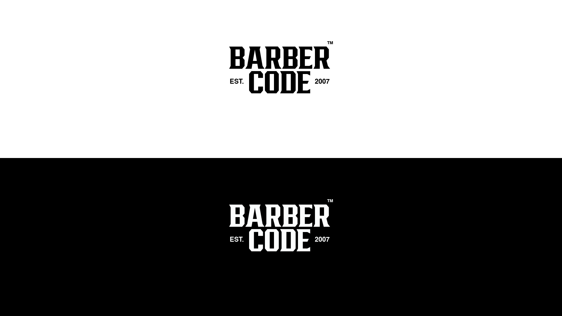
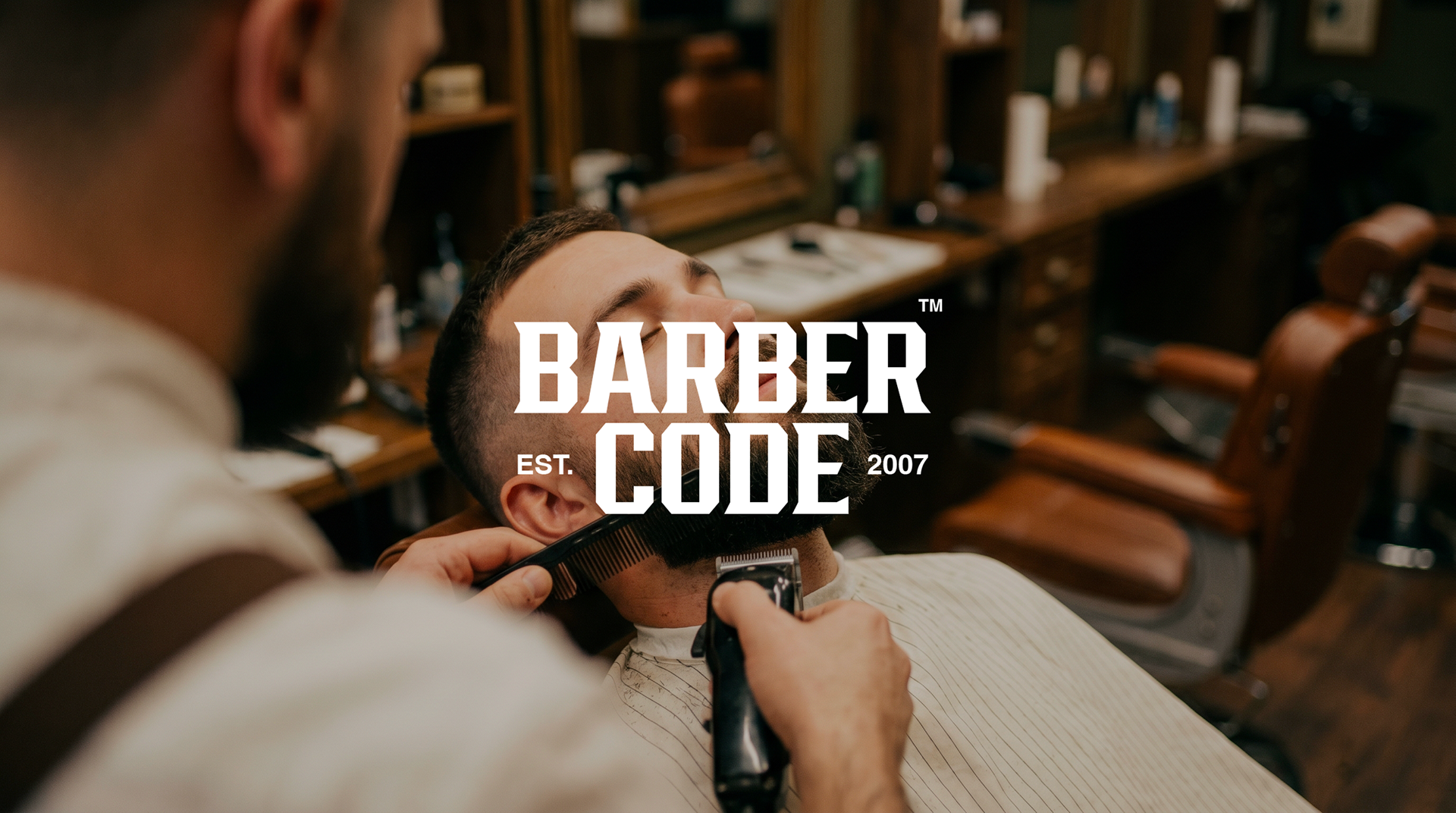
J’ai conçu l’identité visuelle d’un barbershop en développant une direction artistique minimaliste, centrée sur une palette noir et blanc. L’objectif était de créer un logo à l’esthétique brute et vintage, subtilement équilibrée par une approche contemporaine.
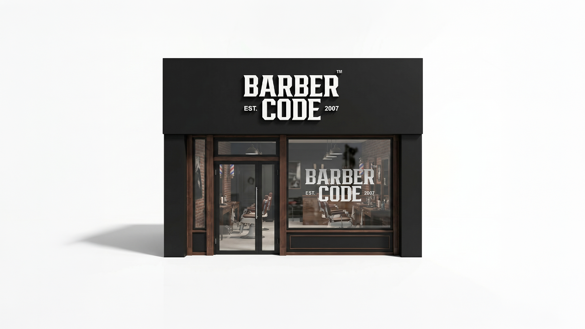
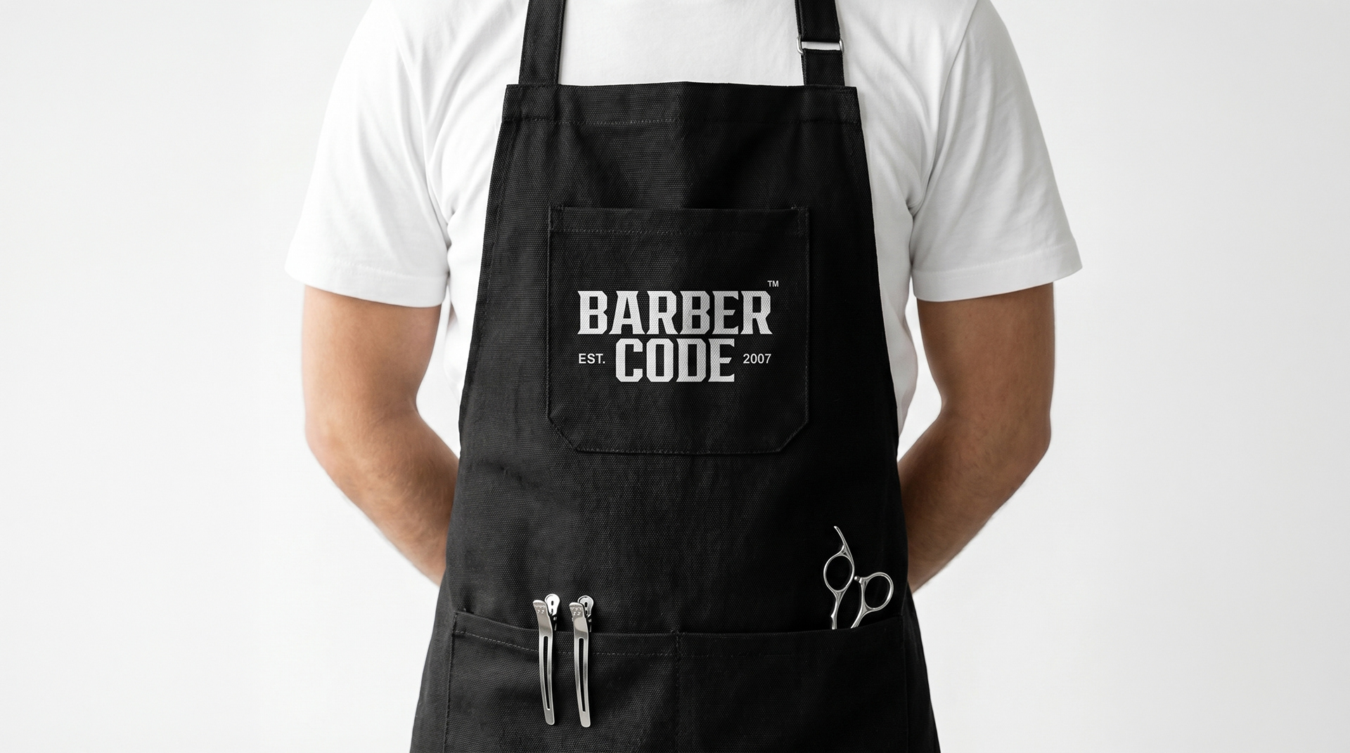
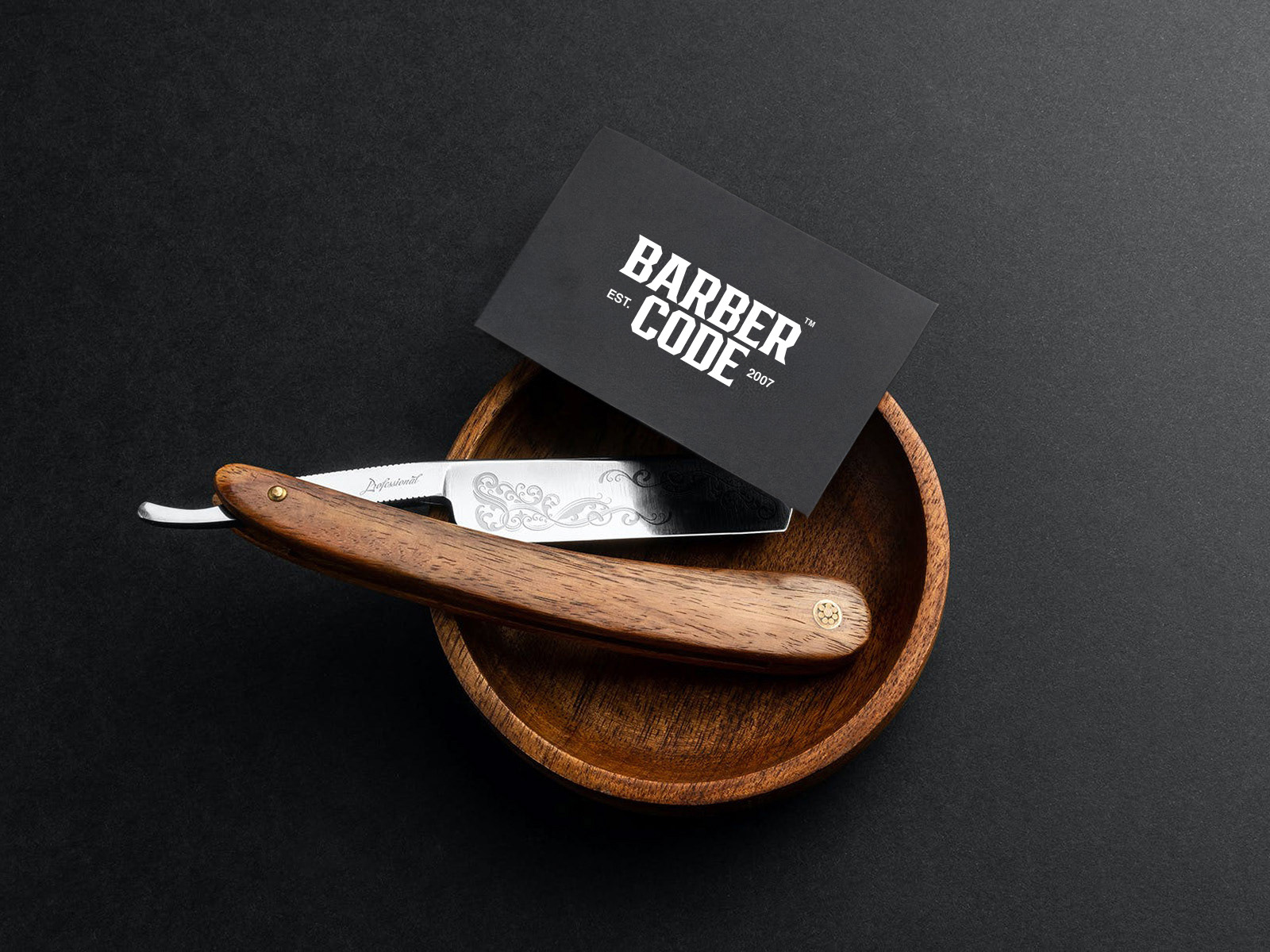
Le client souhaitait une identité à la fois lisible, impactante et facilement déclinable sur l’ensemble des supports. Le concept repose donc sur une extrême simplicité : une composition typographique épurée, intégrant uniquement le nom de la marque accompagné de la mention “Est. 2007”, sans éléments graphiques superflus.
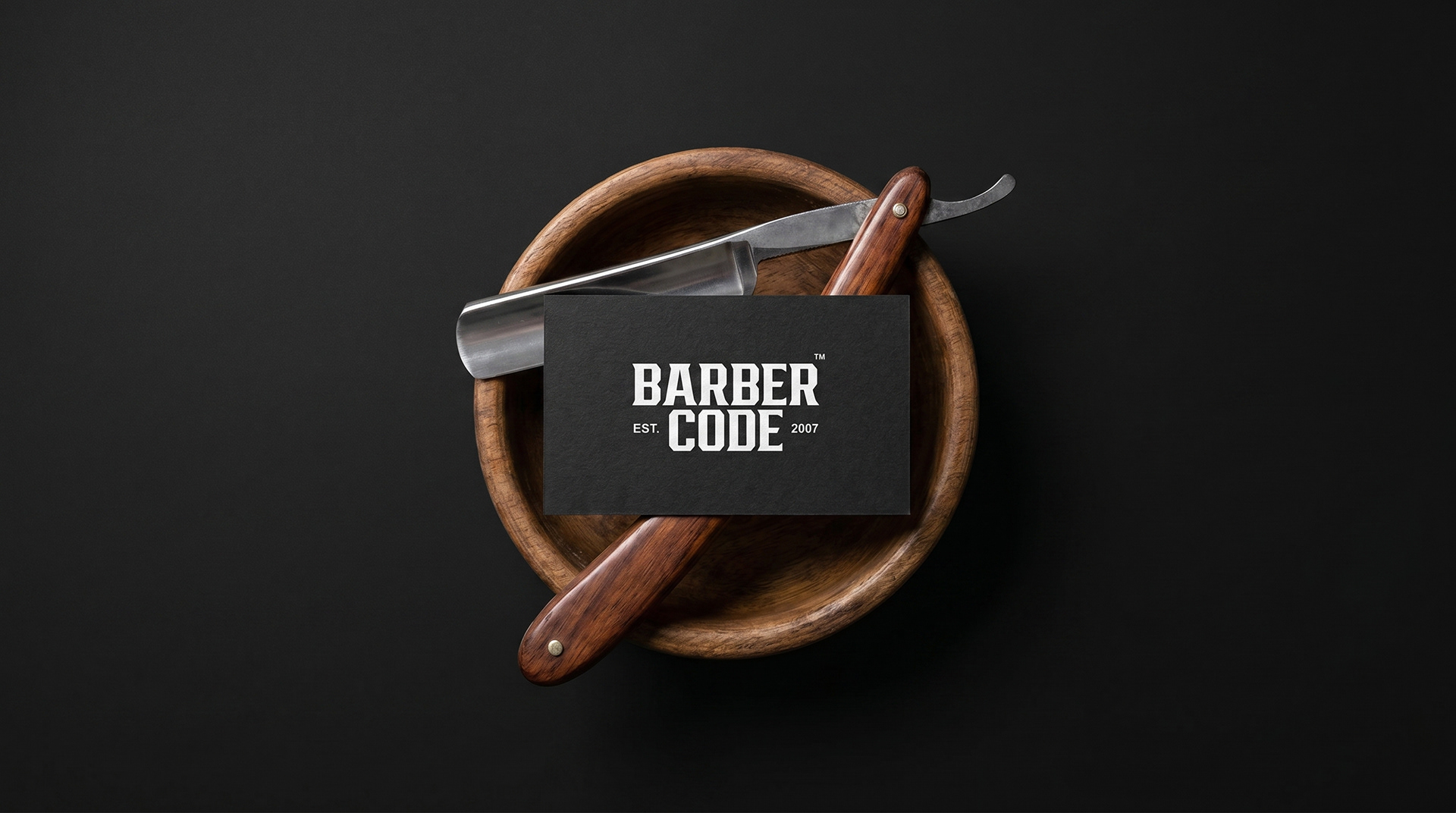
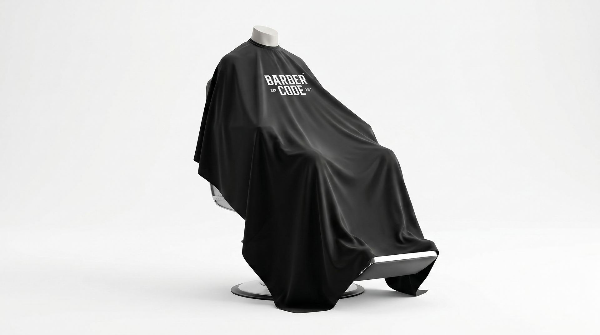
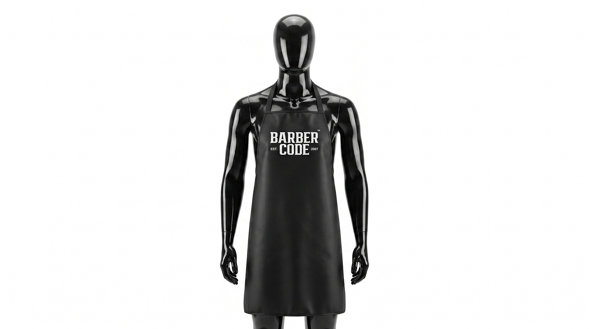
Ce choix permet de renforcer la clarté du message tout en assurant une forte présence visuelle, quelle que soit son application (signalétique, print, digital).
Ce projet illustre une démarche où tradition et modernité se rencontrent, donnant naissance à une identité à la fois intemporelle, cohérente et mémorable.
EN
I designed the visual identity of a barbershop through a minimalist art direction built around a black-and-white palette. The goal was to create a logo with a raw, vintage aesthetic, subtly balanced with a modern approach.
The client wanted an identity that is both highly legible and versatile across all mediums. The concept is rooted in simplicity: a clean typographic composition featuring only the brand name alongside “Est. 2007”, with no unnecessary graphic elements.
This stripped-back approach enhances clarity while maintaining strong visual impact across various applications, from signage to print and digital platforms.
This project reflects a design approach where tradition meets modernity, resulting in a strong, timeless, and memorable brand identity.